Responsive HTML5 image gallery tutorial
January 2014
Native or HTML5/hybrid app? The debate is on and most likely won't end up
anytime soon. Both native and HTML5 technologies evolve at a rapid pace, and
both have their pros and cons. I could chat about native vs HTML but instead
went on to code, to experiment how far it is possible to push HTML5 to
provide a native alike user experience. The image gallery is a simple sample
app that I came up with. This blog briefly explains the building blocks of the
app.
Note that images are fetched from the public Flickr feed. It's their fault if you see something odd... And I did not yet test Internet Explorer; IE9 is minimum.
Features
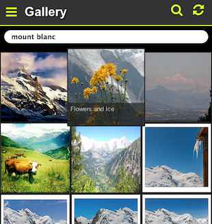
The gallery app is a simple but yet "complete" to function as a tutorial HTML5 application. The app has the following features:
- 3 sections: Main gallery, Favorites and About.
- Fetch images from Flickr.
- Search images with tags.
- Carousel component: zoom the image and swipe between images.
- Favorites: images can be favorited; the list of favorites is remembered.
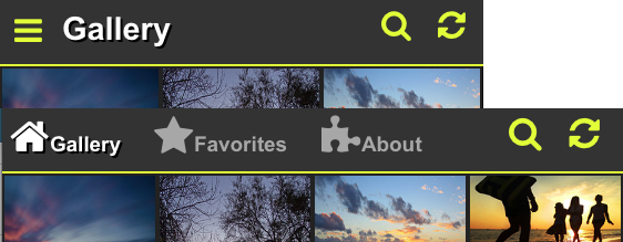
- Menu drawer component for small screens. Very typical component in both native and HTML5 mobile apps, sliding in from left of screen.
Building blocks
The tutorial gallery app demonstrates the following technical building blocks that are essential for modern HTML5 mobile apps:
- Responsivity: adjust layout and behaviour
- Touch event handling
- Fastclicks without 300ms click delay
- CSS3 accelerations
- SPA architecture
- Scalable graphics via icon font
- Client side local storage
The app has the following external library dependencies:
There is only 1 HTML, 1 CSS and 1 JS file in the app (plus above external files).
Responsivity
The gallery app is a responsive web app: by using CSS media queries it
adapts its layout and behaviour according to the device; adapting from mobile
to desktop. It has 2 main layouts: a small screen layout and a bigger screen
layout.
In the small screen layout, the header only shows the current section name. A horizontally sliding menu drawer can be opened on demand which lists the all 3 sections of the app.
In the large screen layout, the header shows all 3 tabs and the menu drawer is disabled.
In addition to 2 main layouts, the number of image tiles changes from 3 to 8
according to viewport size. Try resizing your browser.
Small screen kicks in under width of 550px, and can be seen on most smart phones in portrait mode. Turning phone into landscape activates large screen. (Atleast in Galaxy S3 and iPhones.)
But responsivity is not only about layout changes; in my opinion it is also
about adapting the behavior of the app, see touch events next.
Touch events
In a typical mobile gallery application, it is expected that the images can be swiped left and right with a finger. A gallery app with no swipe lets the user down and just doesn't feel right.
In the tutorial app, finger swipe is properly implemented with the help of
hammer.js library that provides touch gesture events for the app. It would
have been possible to capture events touchstart/touchmove/touchend on my own,
but hammer.js nicely hides away the nasty browser differences and provides a
higher level gesture abstraction. Recommended for mobile projects. The carousel code was taken from the good Hammer.js demo.
And since there is no pointer, touch browsers do not really have a :hover
pseudostyle. Instead, they simulate :hover by activating it just before the
click. This sudden hover effect can lead to unexpected visualization. Hence it
is usually better to disable the :hover style on touch devices. In the app,
the image title is thus only visible in the :hover style in the desktop.
To detect touch capability, I'm using Modernizer library which attaches the
class "touch" to html if touch capability is detected. In CSS, I can then
easily enable or disable CSS styles on touch/desktop browser like this:
/* enable transition on desktop */
html:not(.touch) div.my:hover {
    -webkit-transform: scale(1.1,1.1);
    z-index: 30;
}
/* just opacity on mobile */
html.touch div.my:active {
    opacity: 0.7;
}
Swipe gesture is essential in mobile but it has also become common in desktop. Since Hammer.js provides the swipe event also on desktop, I'm not disabling it in the demo either.
Fast clicks
Speed is essential in good user experiences; all kinds of delays annoy the
user. The infamous 300ms click delay in mobile surfing is a nuicance that is
just recently getting properly addressed.
Chrome 32 on Android has no click delay
if width=device-width is specified in meta data.
Internet Explorer has touch-action property. Other vendors follow suit.
You can verify the click delay yourself. (Chrome 32 on Android: no click delay anymore.)
Before the browsers natively support fast clicks, we can get rid of the delay with the help of Javascript. FastClick is a library that enables fast clicks. It is very simple to use - a single line of Javascript will do:
FastClick.attach(document.body);
By using event delegation, this single event handler attached to the document body fastens clicks anywhere in the page. Magic!
In addition to fast clicks, always provide instant feedback for the
clicked element! Lack of feedback is bad. You get really simple feedback by
just writing a pseudo style :active that is activated on element click.
This guide applies to both mobile and desktop browsers. A typical :active
style is to press down the element a few pixels. I typically use something like
this:
/* enable pressed down effect on click */
a.ico:active, ul.menu a:active {
    position: relative;
    top: 2px;
}
What is nice is that the :active style is instant also even without the Fastclick library!
CSS3 accelerations
CSS3 accelerations have hit mainstream in web design a while ago but they
still have mysticism around them and it's not quite clear how and to what extent
they should be
applied. We are experimenting and learning.
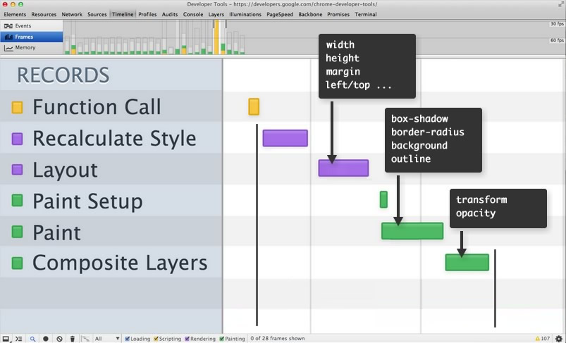
Web developers have understood that animating CSS properties with
Javascript is a no-no performance wise, but what is not widely known is the
fact that even though you are using CSS transitions or CSS animations,
browsers can currently accelerate only some of the CSS properties fast:
transform and opacity. Yes, even common properties left and top are slower to animate.
Accelerations are just hard to implement in browsers and we'll have to wait for browsers to mature. In addition, the current CSS animation model is suboptimal and improvements are being specified in the web-animations working group. To conclude: CSS3 accelerations are somewhat quirky but kind of essential. Use with care.
To achieve silky smooth acceleration in the app at present day, I'm
accelerating only the fast properties "transform and opacity". Acceleration
takes place in many places of the app: for the menu drawer, search input, image hover, image reload and the carousel.
Although there is no lack of menu drawer components in the wild, most of them do not have the best performance. To mention a few good and featureful menu drawer components that do acceleration right, check out Snap.js and Trunk.js.
However, a basic properly accelerated horizontal menu drawer is not hard to do. For learning purposes, I implemented one myself in this tutorial app. Here's the basic CSS:
/* menu drawer is initially hidden outside screen */
#menu {
    position: fixed;
    left: 0; top: 0;
    width: 40%; height: 100%;
    background: #333;
    z-index: 20;

    overflow-y: auto;
    -webkit-overflow-scroll: touch; /* smooth scrolling on mobile */

    -webkit-transition: -webkit-transform 0.2s ease-in;
    -webkit-transform: translate3d(-100%,0,0); /* hide initially */
}
/* adding a class slides menu in from left */
#menu.openmenu {
    -webkit-transform: translate3d(0,0,0);
}
Since CSS3 accelerations are hard to implement and optimize in browsers, there are differences between browsers and platforms. It is important to test acceleration on each platform. Sometimes the right call is to disable the acceleration.
SPA - Single Page App
SPA is a basic well known construction by now: you load a page once and then maintain the state and layout completely in the client. AJAX is used to fetch more resources from servers.
SPA is about speed too. The user experience is a lot better if you can instantly switch pages and not load them from the server. Only SPAs can function as offline/hybrid apps where there might exist no server. SPA's are definately stuff of future.
Most Javascript frameworks implement SPA and page routing. However, if you
want to stay lean and survive without a framework, you can take the simple
approach that I took in this app. Just rely on the old fateful hashchange
event which is supported by every browser. It's simple as this:
// handler for hash change
$(window).on('hashchange', function () {
    route_url();
});

// based on url hash, adjust layout and do stuff
function route_url() {
    var hash = window.location.hash;

    if (!hash) {
        // home
        images.show();
        about.hide();
        favorites.hide();
    } else if (hash == "#about") {
        // about
        images.hide();
        about.show();
        favorites.hide();
    } else if (hash == "#favorites") {
        // favorites
        images.hide();
        about.hide();
        favorites.show();
    }
    // and so on...
}
When the URL gets changed either via regular anchors <a
href="#about">About</a> or javascript window.location.hash = "#about"; the
event handler gets called. Browser back/forward works as expected. Voila.
The tricky bit is to decide what is considered to be a state/hash change and what is not. Think this via browser back; when is an operation to be considered such a large that back should rewind it? For example, while swiping images, does back take you to the previous image or back to the main screen?
Icon font

Since the advent of retina screens and explosion in the number of different
screen sizes, it has become increasingly difficult to deal with raster images
in many sizes. To rescue comes SVG and icon fonts with scalable vector icons!
(Also flat-design trend drives the use of icon fonts.)
One of the most popular icon font currently is Font Awesome with its 369 icons. This font is used in the app.
To minimize the amount of CSS, I only copied the needed stuff from Font Awesome. A bare minimum of CSS to have a single search icon from Font Awesome is just:
@font-face {
    font-family: 'FontAwesome';
    src: url('../fonts/fontawesome-webfont.eot?v=4.0.3');
    src: url('../fonts/fontawesome-webfont.eot?#iefix&v=4.0.3') format('embedded-opentype'), url('../fonts/fontawesome-webfont.woff?v=4.0.3') format('woff'), url('../fonts/fontawesome-webfont.ttf?v=4.0.3') format('truetype'), url('../fonts/fontawesome-webfont.svg?v=4.0.3#fontawesomeregular') format('svg');
    font-weight: normal;
    font-style: normal;
}

.fa {
    display: inline-block;
    font-family: FontAwesome;
    font-style: normal;
    font-weight: normal;
    line-height: 1;
    -webkit-font-smoothing: antialiased;
    -moz-osx-font-smoothing: grayscale;
}

.fa-search:before {
    content: "\f002";
}
The icon is used in HTML like this:
<i class="fa fa-search"></i>
Local storage
Browser local storage offers a simple way to store data on the client side. In the app I store an array of favorited images (an array of objects containing "title" and "url").
Local storage only accepts key/value pairs of strings. With little help from JSON, a builtin library of browsers, we can store any object:
// store an object into localstorage
localStorage.setItem("imgdata", JSON.stringify(data));

// read an object from localstorage
var data = JSON.parse(localStorage.getItem("imgdata") || "[]");
TODO
Since I tried to keep the size of the code at minimum, I have left out a few improvements:
- Portrait images. Currently portrait images overflow and are not properly fitted in screen.
- Support for full-size images. Currently only the thumbnail being displayed.
- No zoom for images since user-scalable=no in meta. Allow user scalability? Does it break layout?
- Use Autoprefixer or LESS for handling CSS vendor prefixes. A must have in bigger projects.
- Improved responsivity: have search bar in the header when screen wide enough, for example.
- Develop a similar native Android app; compare effort and result...
- Develop a similar native iPhone app; compare effort and result...
- Test with Internet Explorer.
Phonegap
To complete this tutorial, I'll soon wrap up the app with Phonegap and
provide the wrapping in the Android Play store. In theory it is the same HTML5
app that just runs in an embedded browser control, but the browser engine is most likely different, atleast on Android.
Stay tuned.
Back